Under the Influence: Comics
Comics Imagery
Introduction
Under the Influence: The Comics examines the work of a group of artists indebted to the style and energy of “comics” imagery. This genre has begun to proliferate in the 30s and 40s, and have become a significant visual language of American popular culture. In an iconoclastic move, the pop artists embraced mass culture and the comics in their paintings and sculpture. Over the years many artists have been drawn to the action, fantasy and humor of the “funnies” and cartoons. While one immediately associates a lighthearted sensibility and playfulness with the comics, their power as an image goes much farther. Their seductive appeal and wide accessibility make them a perfect vehicle for persuasion – for expressing a political stand as well as selling corn flakes. The artists in this exhibition work in a broad array of styles and media, and span a time period from the early 60s to the present.
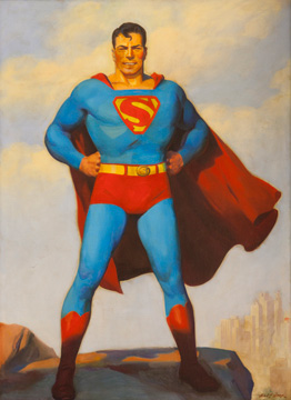
H. J. Ward’s Superman (1940) is a special addition to the show and offers a counterpoint to the contemporary artists’ works. Now in the collection of Lehman College, it once hung on the walls of the DC Comics offices. The painting, created as a promotional image for the Superman radio show — it was to be used as a signed “fan photo” — became the first official portrait of the superhero. Even when it was ultimately not used for the “fan photo” to promote the show, but a line drawing based on it, this painting defined the standard features of this character. H. J. Ward’s version made Superman evolve from a rudimentary line drawing to a real flesh and blood character. Strong, with hands on his hips, he defends the metropolis in the background. It is a persona developed on the eve of America’s entry into WWII.
Portraiture is a noticeable choice in many of the works on view. Heroes, cartoon characters, icons of pop culture are a constant, although not always depicted in the traditional way. Peter Saul has variously been attached to Pop Art, Surrealism, and Expressionism. Anyhow, his Superman (1962) adds a different perspective to that of H. J. Ward. In the drawing, a headless Superman bears a gun amidst an underworld of consumer culture and sexual references. The spinach container might be an allusion to Popeye. Here the stories have been blurred and blended and the scene, as a whole, is fairly abstract and open-ended. Along with the image of Mickey Mouse or Donald Duck, recurrent in Saul’s work, these characters introduce a critique on the construction of heroes in American society.
Mickey Mouse is also a recurring image in the work of Darren Lago. In Mickey in Trafalgar Square (2008-2009), this artist merges two iconic images — that of the Disney character’s classic silhouette (without any details of face or figure) and that of Dutch artist Piet Mondrian’s familiar primary-colored grid. These ubiquitous “brands” are immediately recognizable, and a continuation of the artist’s practice of bringing together art history and mass culture.
Mark Dean Veca’s Great (2011), presents a rendering of Tony the Tiger, the cartoon character and corporate food icon developed in the early ‘50s as a Sugar Frosted Flakes spokesman. Familiar to many from childhood, there is also a sense of nostalgia. Like Superman, he too strikes a hero’s pose. Tony’s organic, interior lines, looking like worms or intestines, animate the painting. A bold background color sets off the figure. Veca’s over the top, pop culture iconography is rendered in a hand-drawn ink line that is straight out of the comics. His style has variously been referred to as cartoon abstraction and psychedelic phantasmagoria. The exhibition also includes his Dollar Sign (2009), an interpretation of Warhol’s Dollar Sign that is both a comment on consumer culture and an art historical reference.
As opposed to these bigger-than-life characters, other artists introduce images of people that are more connected to a “here and now”. Some invented, some real, they present visual diaries, commenting on everyday life. Eventually, some of them have the potential to become the heroes of tomorrow. In I visit Bob (1981), William T. Wiley documents a visit to the studio of his good friend, artist Robert Hudson, right before Hudson’s work was being sent to a show in New York, in 1984. The text continues in the painting: “before all that color goes East…” The contraposition of a colored palette and a black and white drawing of Hudson’s studio, adds an emotional touch to this piece, which is filled with the artist’s observations. Wiley and Hudson not only grew up together, but they share a similar sensibility towards art, which led them to collaborate on a series of works in the nineties. One of the founders of West Coast Funk art, Wiley incorporates cartoon-like drawings and musings laced with puns and personal quotations. As in other works of his, the composition breaks into what seems to be several paintings inside the same canvas.
Luis Cruz Azaceta, a Cuban émigré, has for many years used his portrait as a vehicle to comment on his experiences in the United States. In My Head is Like a Burning House (1981), the main scene literally takes place in his head and illustrates what happened after a late night out partying while he was a visiting artist at the University of California, Davis, in 1981. Beyond the biographical, Azaceta addresses universal aspects of life such as isolation, miscommunication, displacement, violence and fear.
A pioneer of the site-specific installation, Red Grooms has long been known for his comic-inspired work. In this exhibition his colorful bas-relief, Mike and Chuck (2009), refers to an historic event that occurred on Groundhog Day in 2009. While officiating at the February 1 ceremony that determines whether the winter will be long or short, Mayor Michael Bloomberg, was bitten by Chuck, a local groundhog from the Staten Island Zoo. In Grooms’ version, the moment (and the Mayor’s bloody hand) are captured by a CBS cameraman.
In Underground People (2010) Felipe Galindo sketches portraits in the subway using the MTA map as his drawing paper. With a style that could be placed somewhere between illustration and comic imagery, he continues a practice of making social chronicles, that he has followed for years. The piece shows a wide range of archetypical figures that are recurrent in today’s society. Galindo’s work conveys the diversity of New Yorkers who meet underground, creating a second mapping of the transit system.
Pablo Helguera’s Artoons series parody the contemporary art world with humor and insight using the cartoon as the vehicle. (It is a world he has observed as an artist, writer, and museum educator.) Curators are the New Artists (2010), Basically I’ve always found… (2010), and The One on the Left… (2011) are large-scale line drawings, vinyl applied directly to the wall. They have the look of New Yorker cartoons and a similar sensibility. The cast of characters, including artists, collectors, dealers, critics, curators, and historians, offer an insider’s view, chronicling the arcane social rituals and economic practices.
Steve Gianakos’ work results from the combination of found images. His iconography is indebted to the cartoon graphics of the ‘30s and ‘40s. Animals and humans often merge into surreal bodies, as it is the case of the piece in the exhibition Untitled (1998), which shows a rooster’s breast with a human profile. The paper has been intentionally distressed to give it a derelict look.
John Wesley creates enigmatic works that resonate in the viewer’s mind. These are often incongruous images that connect somewhere in the unconscious. Wesley begins by tracing pictures found in magazines or books, then translates them into gouache drawings and finally into acrylic paintings. These elements are combined and sometimes repeated, then rendered in flat colors. Wine Juggler (1991) captures the action in a simple straightforward way. With a hat balanced on the figure’s forehead, the facial features are obscured except for the large mustache.
Laylah Ali’s gouaches Untitled (Blue Vest) (2004) and Untitled, (2004), develop from her well-known series of “Green Heads.” Similar in aesthetics and style though less political, the figures presented in the exhibition stand still, bearing unrecognizable attributes and adornments. Looking to the side in a three-quarters view, the figures appear to be immersed in their own world, leaving the viewer to imagine the story behind them. Carefully outlined and with great charisma and dignity, they seem to be contemporary classical portraits. Their androgynous quality makes it difficult to connect them to specific cultural, social, or political coordinates.
Other groups of artists in the exhibition have used cartoon imagery to explore social, political or economic issues. Their approaches range from metaphoric to more straightforward and militant allusions. For almost forty years Sue Coe has focused on advocacy for social and political justice through her paintings, prints, and drawings. During that time she has also worked as an illustrator for newspapers and magazines, a medium providing a means to reach broad audiences. Coe has a strong graphic style, influenced by the work of Goya, Rembrandt, and Kollwitz, and is connected, in some ways, to the political cartoon tradition. Among the many issues she has addressed, perhaps the closest to her are those reflected in the print Second Millennium (1998), — animal rights, the meat industry, destruction of the environment, famine. (She grew up near a slaughterhouse and has been an animal rights activist since her teens.) Dark and apocalyptic, Second Millennium presents a landscape that is filled with scenes reminiscent of a Last Judgment out of Brueghel or Bosch. A large meat grinder dominates the print. Vignettes in the night sky allude to the space program and animal experimentation in the lab but also place the actions in a cosmic context.
Viewed through a large, viscous droplet hanging from a rotting tree, Sandy Winters’ toxic landscape, Against the Tide (2007), offers a postscript to the primordial swamp from which life first emerged. Here mutant, mechanical creatures with fan-like parts are collaged into the scene. Others incubate in cocoons and continue the life cycle. Winters’ unprimed birch panel lends a wood-grained pattern to the surface of the painting. The setting sun in the distance seems radioactive and an ominous forecast for the future.
Based on a painting from 1995, Lázaro Saavedra’s Sacred Heart (2000) depicts this popular motif in the Catholic iconography as it is often found in Cuban homes. The piece comments on the critical period when the Communist block collapsed and the Island embraced capitalist ways and politics as means of survival. Humor permeates the references to the preservation of a Cuban identity at this crucial moment. Christ bears a Cuban heart, “speaks” as the Soviet Union but actually “thinks” as the United States. The work also reveals the complex relations of these three countries, historically.
Enrique Chagoya’s work, on the other hand, is part of a broader series of illegal alien’s guides. Having emigrated from Mexico, this artist addresses the experience of displacement and the multicultural encounters taking place in today’s society. He has developed the concept of ‘reverse anthropology’, through which he looks towards mainstream cultures from a Latin American perspective. Illegal Aliens Guide to the Surplus of Nothingness (2009), is formatted as a pre-Columbian codex. Drifting figures in a broad sea range from an oil tanker to Picasso’s art, the Cuban balseros and Popeye. As with the codices, the more one looks, the more one discovers.
Imaginary stories, where fantastic creatures inhabit their own worlds and follow their own laws, are also a thread through many of the works. Since 1998 D. Dominick Lombardi has been developing an elaborate narrative — the Post Apocalyptic Tattoo Series — that focuses on fictional characters: mutants that have survived a great cataclysm. His colorful, abstracted shapes painted in reverse on Plexiglas, represent shrunken heads (a highly sought after memorial in this case) created by one of the characters, Johnny Two-Heads. Lombardi’s project grew out of doodles in a sketchbook and an anxiety over the fate of the universe.
Sean McCarthy is known for meticulous drawings of monsters and demons that are created with the precision of an etching. In his new series, Maladapted, he creates animal hybrids developed through imaginative invention, and a loosely structured system based on actual species. Configured almost like an “exquisite corpse” drawing, McCarthy develops the creatures by mixing and matching animal parts from three different phyla. In The Watering Hole (2010-11), a setting akin to the neighborhood bar, there is a congenial gathering of animals that despite their sources look totally unfamiliar. These creatures with pastel colors seem more lovable than fierce. Several art historical precedents – specifically works by Francisco de Goya, Paul Gauguin and Francis Bacon — influenced the look of the composition for this drawing.
James Barness, whose work often deals with relationships, presents a domestic scene with animal characters and fairytale flourishes. His painting, The Distractions (2005), shows a cat-like mother about to swing a shovel and a dog-like father bearing a cat-o’-nine-tails, a second before engaging in battle. A child at the mother’s breast and another on the father’s back round out the classic American family of four. Script-like lines abound throughout the painting including a meander pattern collaged at the edge to create a decorative border. A ribbon-like, quasi-cryptic text reads, “We must remember not to fall in with the cat’s plan for us.” It is a line from John Ashberry and maybe a warning for all of us.
Using a different approach, Gary Panter’s Car Craft (2004), has been made in a free-and-easy style in which the images seem to flow in a stream of consciousness. The artist superimposes a graphic layer of outlined black figures to abstract areas of greens and blues, as if he decided to draw on wallpaper. Recurrent symbols -such as the brick wall or the female breasts, are recognizable. Some figures were started and dropped, at some point. They all stand by a central image — a customized car — that gives title to the work.
Tom Otterness draws from fairy tales, myths and his own fantasies, to create stories and fables in cast bronze sculptures. Very stylized characters –humans and animals- interact with each other in a playful manner. The contrast of scale is always meaningful. Little men, like cartoon characters in three dimensions, interact with giant figures in situations that are often humorous. Behind a graceful appearance, the pieces are full of symbols and allusions. In Fish with Pencil (2007), a little man teaches a big fish how to write. Human body parts — in this instance hands, legs, and a tongue – are an incongruent addition that sneaks in a bit more humor.
Wall Fragment with Mobile Play Station (2010) resembles an Italian fresco depicting a contemporary technological landscape and modern warfare as if it were a computer game. Dan Hernandez borrows techniques and aesthetics from Renaissance paintings to create fake wall fragments that appear aged with time. The contrast between representation and theme, as well as the impasse created by the different tempos –the slow process of murals and the velocity of today’s computer animation and gaming – raise questions about our relation to the past and the way we address time and history, as a modern culture.
Priscila De Carvahlo depicts scenes from events in different cities of the world to create an urban landscape —the Mermaid Parade in Coney Island, the Carnival in Brazil, and the West Indies Parade in Brooklyn. In Untitled (Parachutes)(2009), the graphic quality of watchtowers and parachutes contrasts with the pastel colors and comic-like elements, adding certain playfulness to the work. Steps creating pathways, spill off the wall, fill the gallery, and loop back again. Black electrical poles with cables fill the space and cast shadows. The use of recycled materials — from Styrofoam, to plastic pipes and cardboard — has become a signature strategy in her work. Among other allusions, De Carvalho makes reference to the favelas — shantytown communities of her native Brazil.
Artists employ the comics to tell stories, to mark historical events, to make social and political comments, to create portraits, to reference art history or, drawing heavily on their own experience, to create visual diaries. In all cases the works address the complex, profound, and overwhelming matters of human existence.


